12 Things Every Church Website Must Have
When people want to find a new church, one of the first places they look is local church websites. They want to explore the churches around them before they ever set foot in one.
And when your members want to learn more about something your church is doing, or get more connected, they head to your website, too.
Your church website needs to be a hub for both new people who have never been to your church and members who have been with you for years. If you want new people to choose your church and you want to serve your members well, there are a lot of pages, information, and types of content your church website simply has to have.
In fact, in this digital age, it’s critical that churches use the digital platforms their communities are using and use those channels well. If not churches can stunt their own growth by not meeting people where they are.
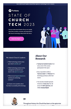
State of
Church Tech
Discover what church leaders like you are saying about their priorities, concerns, and expectations with church technology, today and for the future.

In the meantime, whether you’re creating a brand-new website or you want to improve the one you have, we’ve pulled together 12 things every church website must have (plus, we threw in some bonus recommendations).
1. Pictures of your church
Sadly, this is one of the biggest things many church websites miss. They include all the right information and branding, but the photos are either stock images or non-existent. Your website should have pictures of both your church facility and the actual people who attend and serve your church.
Generic stock photos of happy people can easily be misleading, because they lack a sense of authenticity. You want your website to show potential visitors and current members what your congregation is actually like, and one of the best ways to do that is with pictures of the real people who are part of your church.
You don’t have to fake happiness or stage candid moments. Just take photos of the things your church does during the service, through your ministries, and in other gatherings like small groups or events. It will help newcomers envision finding a real community at your church.
2. Online giving
Whether you use text-to-give, mobile giving, giving kiosks, or some other form of online giving (like a webform), your website needs to have a dedicated page that explains how it works and encourages people to support the work your church is doing.
You want this to be brief, because if people want to give, you don’t want to hide the call-to-action (the give button) beneath a wall of text. But this page is also a great place to point to documents or other pages that explain the impact your church’s generosity has had, the real results of your ministry, and some of the projects you hope to accomplish in the months and years ahead.
For members, your website is one of the first places they’ll look if they don’t already have your church app or know how online giving works. This is information they’ll expect to find on your website, and that’s why it needs to be here. Make sure you have a link to your mobile giving solution or church app and encourage members to download it.
But online giving isn’t just valuable for members, either. When people encounter your sermons, events, and other content through their friends and family, they may be inspired to give even if they don’t go to your church.
Having a dedicated page for giving makes it easy to link directly to online giving in your blog posts, online devotionals, and social media posts.
3. Staff profiles
One of the best ways for people to learn what your community is like is from getting to know the people who lead it. Most churches have some sort of staff page with pictures of each staff member, but there are two big mistakes a lot of churches make with these pages:
- They forget to keep them up-to-date
- They only tell you each staff person’s name and title
When your staff page isn’t up-to-date, you risk putting visitors in an uncomfortable position. Imagine the awkwardness of asking to speak to someone you saw on the website only to find out they left the church two years ago or talking to someone you think is the youth director only to find out they aren’t any longer. Those are the kinds of embarrassing encounters you want to avoid.
Make sure you keep your staff photos updated, too. Everyone’s appearance changes over time and it’s no good having pics of your staff if they all look different. Plan on updating all images every couple of years. This will help keep your site from feeling outdated.
While pictures are nice, it’s hard to get to know someone from a photo. Your staff page is an opportunity for your staff to be vulnerable and share their stories, their passions, and why they love what they do (briefly). Every single one of those stories is an opportunity for visitors and members alike to feel more connected to your church. Just be sure you focus on the most important information. 100–150 words should be more than enough.
4. Location
One of the first things a potential visitor expects to learn from your website is where your church is located. This plays a huge factor in helping them decide if they want to go to your church. And if your location isn’t prominently displayed, people may wind up going to a church that’s farther away, simply because you didn’t tell them you were part of their community.
Not only should your address be prominent on your home page, but you should include it in the footer of every page.
Every church should make it as easy as possible to find their meeting place. That’s why your website should also connect to Google Maps, so people can quickly get directions. Be sure you verify Google My Business.
This information is also important because Google uses it when people search for things like “churches near me.” If you don’t have this basic information on your website, people are going to find other churches first.
5. Service times
Another thing visitors want to know right off the bat is when they should show up. If someone doesn’t have a friend or family member to ask, their only other option is to contact you to find out when your service times are. That might not sound too inconvenient to you, but it’s more of a hassle than clicking or tapping around website by yourself, and if other local churches make this information visible, potential visitors are just going to go there instead.
This is also really valuable for churches that have multiple service times, because people can easily find the time that works best with their schedule. And if some services have different styles of worship or other major differences, that’s worth noting as well.
6. An about page
Potential visitors are looking for a church they can feel connected to. They may also be looking for a specific type of church. That’s why your about page should have a balance of basic information (like your denomination, if you’re connected to one), and the story of your church. This should be a brief history lesson on when, where, why, and how your church got started.
You may want to include your church’s mission and vision here, but don’t let that be the only thing people find on this page. Mission and vision statements can help paint a picture of what your church cares about and where you’re heading, but they often lack the story elements potential visitors are hoping to find and connect with.
7. Contact information
People need a way to contact your church from your website. If someone wants to get a hold of your church, they aren’t going to look you up in the phone book. They’re going to Google you, or head straight to your website. But “contact information” can mean a lot of different things, and there are several ways your website should facilitate communication.
When people want to contact an organization, they expect to find a phone number, mailing address, and an email address. If you’re especially responsive on social media, you could include that here as well. And while “contact forms” can look tacky, they provide a simple way for people to communicate with you through your website, which means they don’t need to go anywhere else.
But sometimes people go to your website when they want to contact a specific staff person, such as your senior pastor, or whoever preached last weekend, or the person running a specific ministry. Ideally, your staff page should have contact information for each member of your team. But at the very least, you should include the phone number or email address for an administrator who will filter messages to the right people. However you do it, the point is to proactively answer the question, “How do I talk to ___?”
State of
Church Tech
Discover what church leaders like you are saying about their priorities, concerns, and expectations with church technology, today and for the future.

8. Sermons
A lot of times potential church visitors will try to watch or listen to your sermons before they attend your service. Since the majority of your service each week is the sermon, and your teaching is one of the most visible aspects of your ministry, this is one of the best ways for potential visitors to experience your church without making a big commitment, and they can do it on their own schedule.
There are several ways to archive your sermons, but whether you record video or audio, or you simply transcribe them, be sure to organize them in a helpful way, so people can clearly see what your sermon is about. When people are browsing your sermons, they’re going to naturally look for one that interests them, so you should make it easier for them to find one.
Your sermon page is an ideal place to offer a link to download your church app. It reminds members to use the app and encourages potential visitors to take a step toward deeper engagement with you.
9. Ministries
Your church website should be a launchpad for people to explore the key things your church is doing. Even if your members have been part of your church for years, they may not know much about some of the ways your church serves together. Having a “Ministries” page gives you a place to talk about what each of your ministries are accomplishing, why they exist, how they connect to your church’s mission and vision, and how to volunteer.
This is another opportunity for you to show (not just tell) visitors about your church’s heart. It’s one thing to say you care about serving the poor and caring for those with mental illness. It’s another to show pictures of your congregation actually doing those things and to describe your partnerships with local nonprofits.
10. Events
You put a lot of work into special events. But no matter how good your event is, its success or failure depends on how well you promote it. If people only hear about your events during weekend services, then at most they’re only going to learn about them once a week!
A dedicated events page on your church website makes it easy to share a link to your event, and it can also provide a simple way for people to register for your event without having to mail in forms or bring them to church.
Conferences, retreats, guest speakers, baptisms, barbecues, and other community gatherings like these are opportunities for your members to experience something different, and they’re often one of the best times for them to invite their friends and family that don’t normally come to church.
They also give visitors alternative ways to check out your church that may be more appealing to them than a typical weekend service. Special events can be a great way for people who discover you online to get connected.
11. Opportunities to get involved
A lot of churches highlight programs or ways to get involved at specific times of year. Maybe they’ll have an annual small group dinner, or a seasonal push for volunteers. But these are things you want people to plug into year round. So why not have a place for people to learn about them on their own, at any time?
This page should talk about any ministry or volunteer teams that need help, and it could point to upcoming projects your church is doing in the community.
12. Branding
Your church should look and feel the same online as it does in person. We already talked about having photos of your actual church (the people and your facility), but branding goes beyond that. It’s your logo, your tone, your focus, your imagery and colors, and the way you describe and represent your church to the world.
It may seem like a lot of insignificant details, but church branding is ultimately about creating consistency, increasing recognition, and reinforcing the identity of your church. It’s about being who you say you are, online and in-person.
Bonus recommendations
Those are all the things we think church websites need to have. But there are a few other things that could make your website a lot more valuable to your members and potential visitors. They’re definitely optional, but they’re absolutely valuable.
Here are just a couple of them.
Live stream of your service
Some people imagine that when you set up a live stream of your service, everyone is going to stop showing up on weekends because they can watch from home. But that’s not how it works.
Live streams are for people who are out of town, sick, or otherwise unable to make it to your weekly gatherings. For the longtime member who now lives in a nursing home. For the college student who still hasn’t found a church in their new town. For the person who had to leave for a business trip. The family on vacation. The parents dealing with a last-minute diaper blowout.
Your members can’t be with you every Sunday, but a live stream helps them feel like they’re there with you.
It’s also a great way for visitors to “dip their toe in” before taking the plunge and joining you on the weekend. And it can create opportunities to partner with and serve other churches that don’t have the teaching talent your church does.
Church blog
Maybe you have a gifted writer on staff or in your congregation. Why not put that gift to work for your church? A blog is a great place for you to share about what’s going on in your church each week, or to explain aspects of what you do in greater detail, or to give your congregation a unique devotional that parallels what your staff is learning or what you’re teaching through.
Church podcast
A podcast works the same way as a blog, but it lends itself to other interesting types of content. You could interview volunteers, ministry leaders, local organizations, or staff members. You could rotate your speakers through podcast episodes when they aren’t teaching.
The point is to provide your congregation with more ways to learn, grow, and benefit from the gifts and insights God has given you. This also helps you keep your members engaged throughout the week.
Imagine what your website could do
Like your church app, your website is a tool to help more people create meaningful connections with your church. It exists to serve your members and help you reach new people. When you think about it that way, your website starts to feel more like an opportunity than an obligation. And the decisions you make become about communicating the most helpful information.
In this digital age, churches can’t successfully engage with their communities without great technology. In fact, not meeting people where they are digitally is one of the top five bad habits that can hinder healthy church growth.
State of
Church Tech
Discover what church leaders like you are saying about their priorities, concerns, and expectations with church technology, today and for the future.

Featured Content
You May Also Like
